Proudly provided to you by the Poster Stamp Collectors Club


Introduction

Click here for Trains pages |
|

Click here for "Z" page |

|

Click here for contents page |

|
 Click here for "A" page |
|

Click here for Trains pages |
|
Pictorial and thematic alphabets are probably as old as printing - perhaps as old as books themselves. Today we may think of them primarily as learning tools for children, but many adults - including me - enjoy making up alphabets as games or entertainments. Edward Gorey is perhaps the best-known modern American creator of illustrated alphabets for adults - his delightfully macabre "The Gashlycrumb Tinies" is my favorite.

So when a couple of friends and I wanted to create something to communicate our love of stamp collecting, an alphabet was the logical choice. I compiled a list of potential topics, and we debated their merits. One important criterion was that each topic we chose had to be able to be easily and attractively illustrated both visually and verbally, and if possible should include a good story or two. For many of the letters, selecting just a single topic was difficult - "B" could have been BEP, or Balloon Mail, or Bluenose, or any of many other excellent subjects. For other letters, finding any topic at all was the challenge - there just aren't many words about ANYTHING that start with "X"! But we finally agreed on our choices - guided sometimes by necessity, others by caprice, others by the desire to tell a tale - and then had the good fortune to obtain the sponsorship of the SF chapter of the AIGA, an organization devoted to promoting the appreciation of graphic arts. Many of its members are themselves graphic artists, and twenty six of them agreed to create images to illustrate the concepts in our alphabet. As the official philatelist of the team, I acquired and photographed actual examples of the topics, using images from auction catalogs when my finances fell short. All three of us developed the definitions in several forms, including one set that was very concise, and originally intended as the text on a set of postcards, and another set of more elaborate ones for a slide show. The slide show has been presented six times now, two of them to chapters of the AIGA, once to a chapter of GDC (Society of Graphic Designers of Canada, the Canadian counterpart of the AIGA), two at stamp exhibitions (Pacific 97 and STAMPSHOW 98), and once to a meeting of a USPS stamp design committee. The intended audience of our presentation thus far has been non-collectors. Our goal was to show people to whom stamp collecting is a mystery what it is about, and why it can be so compelling and fascinating. I can't say for sure that we have made any converts yet, but its reception has been enthusiastic, and we've had fun. In October of 1999 our philatelic alphabet finally saw its first official publication, as a promotional book created by Dickson's Printing of Atlanta; shortly thereafter it was published in the AIGA/SF Newsletter VOX POP; and in September of 2000 it was released as an address book published by Chronicle Books of San Francisco. In all three cases, the 26 artist-created stamp-like images that exemplify the topics are the main focus, while the accompanying text is essentially the brief definitions we had created for the postcards (which have not yet been produced). For the Cinderella collectors out there, each of the books includes a set of the images in stamp form, complete with perforations and gum!
Then in 2008 Alphabetilately was chosen by the Smithsonian National
Postal Museum in Washington, DC as the theme for its 15th Anniversary
celebration!
Go to the NPM site to learn more -
CLICK HERE. It was originally scheduled to be on display
there for just a year, but proved so popular that it remained for seven
years, through October, 2015.
Today that exhibit from the NPM is housed at the Bellefonte, PA headquarters of
the American Philatelic Society, to whom it was donated by the NPM. They
welcome
visitors, and have
an excellent website of their own.
So Alphabetilately lives on in many forms.
While I have enjoyed seeing something that started as just a whimsical
"Wouldn't it
be
fun if ..." evolve into something so varied and successful (almost entirely as a
result
of the efforts of our chief partner, Alyson Kuhn, by the way), I have felt some frustration
from the
constraints of the formats thus far. A slide show cannot last much more than
an hour
without risk of boring the audience, and that provides only about two minutes
per
letter
or topic, which may seem like a fair amount, but is really hardly enough for a
brief
explanation of what the topic is, several examples, and maybe a story or two;
and the
book and newsletter versions have focused more on the images than the topics
themselves,
or examples of the material.
So this web site is my effort to share with other collectors and would-be
collectors a more detailed and yes, philatelic, exploration of our alphabet.
The original title of our effort was Philatelic Ephemera, but for this
incarnation I have chosen to call it Alphabetilately, a merging of the
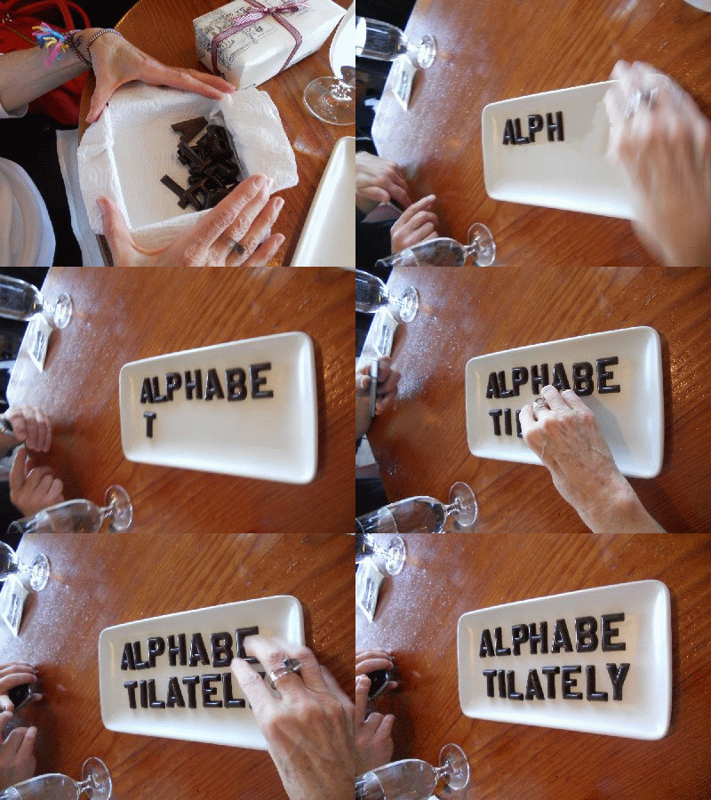
two words Alphabet and Philately. Is that clearer if I
write it like this: alPHabetILATELY?
7/18/18 - Peter C.A. de Jong, philatelist extraordinary of Netherlands,
wrote to comment that To visit the alphabet pages, either click on the link to the "A is for
Advertising Cover" page, below, to step through them in sequence,
or click on the "Contents" link to access a page with links to all of the
letters.
Bill Senkus
Click here to view
a page
showing how the 26 artist images have evolved over the lifetime of this
project.
|
| Home | Z is for Zeppelin Post <<< | Contents | >>> A is for Advertising Cover | Credits |
All Letter images Copyright © 1997, 2000, SF chapter of AIGA
All text Copyright © 2000,2013, William M. Senkus
Send feedback to the webmaster: CLICK HERE
Revised -- 08/4/2025
